
Team Kit Color Matching: How to Brief Colors
A kit that arrives in the wrong blue is an expensive mistake, and it usually starts with a vague brief. This guide shows how to describe your team colors so a manufacturer can reproduce them, and how to check the result before bulk production.
- Never brief a color by name alone. "Royal blue" means different things to different people.
- Send a Pantone reference, a CMYK or hex value and, if you have one, a physical swatch.
- Screens are lit from behind and fabric is not, so approve color on a physical sample, not a mockup.
- Dark and saturated colors are the hardest to repeat. Give them extra attention.
Why colors drift between screen and fabric
Your design file is built from light. Screens mix red, green and blue light, so bright colors such as electric blue or neon green look vivid on a monitor. Printed and dyed fabric reflects light instead, and it cannot always reach the same intensity. A club crest that glows on a laptop can look calmer on a polyester jersey.
Two more things move the result. Every screen is calibrated differently, so the same file looks different on a phone and a desktop. And the fabric itself has a base color, a texture and a finish that all affect what the eye sees. The practical answer is to treat the screen as a rough guide and a physical reference as the real target.
Choosing a color reference
Give your manufacturer more than one way to identify each color. The common options differ in how reliable they are.
| Reference | What it is | Best used for |
|---|---|---|
| Pantone code | A numbered standard color, such as 286 C. Textile versions exist alongside the coated paper ones. | Brand and club colors you must repeat across orders |
| CMYK values | The four inks used in most printing, written as percentages. | Sublimation artwork, where designs are printed in CMYK |
| Hex or RGB value | A screen color code, such as #1F3A93. | A starting point only, since it describes light and not ink |
| Physical swatch | A scrap of fabric, a printed card or an existing jersey. | The most direct comparison, especially for dark colors |
If your crest or sponsor logo has official brand colors, find the guideline document and use the numbers in it. For a school or amateur club with no guideline, pick a Pantone shade you like from a swatch book and write it down so the next order matches. Our custom sports kit design guide covers how colors, logos and sponsor placement fit together on the shirt.
What a good color brief contains
A brief does not need to be long. It needs to be unambiguous. For each color on the kit, list where it appears and how it is identified.
- The location: body, sleeves, collar, shorts, socks, numbers, crest outline.
- A Pantone code, plus CMYK or hex values for the same color.
- A photo or physical swatch if one exists, with the lighting noted.
- Which colors must match exactly, such as the main club color, and which can vary slightly, such as a pale shadow tone.
- Any pairings that must stay readable, for example number color against shirt color.
- The reference for sponsor logos, if the sponsor supplies one.
How fabric and printing change color
The same Pantone value can look different depending on how the color is applied. With sublimation, ink turns to gas and bonds with polyester fibers, so the fabric underneath matters. Printing works best on white or very light polyester, and a colored base will change the final shade. Our guide to how sublimation printing works explains the process and which fabrics suit it.
Embroidery and heat transfer use thread or film in set colors, so those are matched by choosing the closest thread or film shade. That is why a printed body color and an embroidered crest can look slightly different side by side. If both appear on one shirt, compare them together on the sample, not separately. The trade-offs between the two methods are set out in sublimation printing vs embroidery.
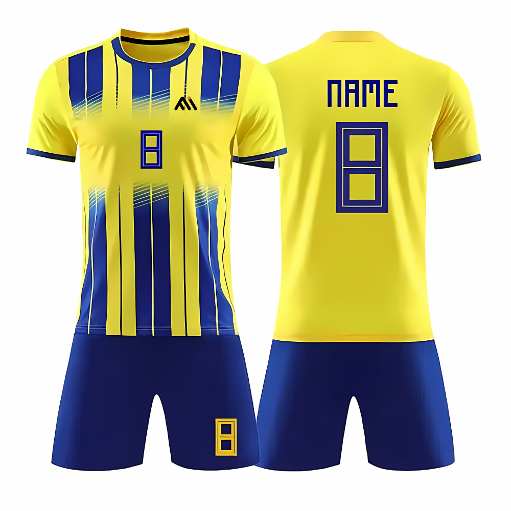
Some effects are harder to repeat than flat colors. Gradients, fades and splatter patterns depend on the exact placement of the print, and dark, saturated shades such as black, navy and deep red show small differences more easily. Look at how finished examples handle this. The yellow and navy stripes on Soccer Uniform ART# MI-2002, the blue gradient fade on ART# MI-2003 and the cyan panels on black in ART# MI-2004 are all different color challenges to brief.
A color approval process
- Collect your referencesGather brand guidelines, existing kits and swatches. Choose a Pantone code for each key color.
- Write the briefSend the list of colors, their locations and the priority colors with your artwork.
- Review the digital proofCheck layout and color names, but do not treat the screen as final color approval.
- Approve a physical sampleLook at it in daylight and under indoor lighting, next to your reference swatch or an old kit.
- Confirm in writingRecord the approved color values with the sample, so bulk production and any reorder use the same target.
Sample cost, lead time and minimum order quantities are not the same for every project. Minimum order, lead time and sample terms are confirmed in the quotation. Our guide on designing a custom soccer team kit with names and numbers shows where color approval sits in a full kit brief.
Common color mistakes
Briefing by name only
"Navy" can mean a dozen shades. Always attach a Pantone, CMYK or swatch reference.
Approving on a phone screen
Brightness settings change how a color looks. Approve on a physical sample.
Mixing references between orders
If last year's kit was matched to one code and this year's brief uses another, the two will not match. Keep your approved values on file.
Ignoring low contrast
Numbers in a color close to the shirt are hard to read from the stands. Check legibility, not just match.
Frequently asked questions
Do I need a Pantone code to order a custom team kit?
No, but it helps a lot. If you have no code, a physical swatch or a clear photo is the next best option. Hex values alone are a weaker reference.
Will the printed color match my screen exactly?
Rarely exactly. Screens emit light and fabric reflects it, so a close match is the realistic goal. Approve a physical sample to confirm.
Why does white look different across kit pieces?
White can vary with fabric type, finish and dye batch. Mention in the brief if white pieces such as shorts and socks must sit well together.
Can I reorder later in the same colors?
Yes, and the best way to protect that is to keep the approved color values and a sample from the first order. Share them with each new brief.
Where do I start if I need a kit made?
Send your artwork, color references, quantities and size spread through the quote request form. Our step-by-step quote guide lists what to include.
Brief your team colors with confidence
Send your artwork and color references and we will confirm minimum order, lead time and sample terms in the quotation. Made in Sialkot, Pakistan, with custom colors, logos and sublimation printing.


